
Tono & Lim Ink Packaging
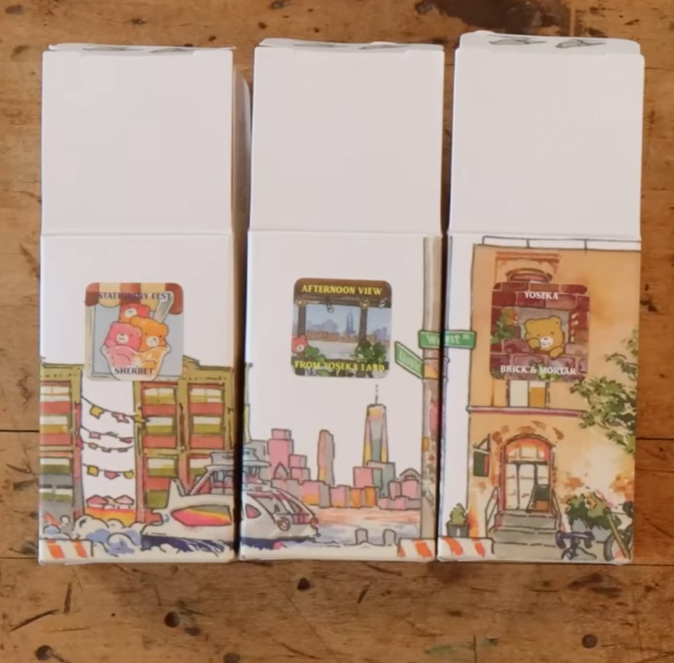
Packaging illustrations for an exclusive ink collaboration with Tono & Lim
Yoseka Stationery reached out about doing the artwork for their upcoming ink collaboration with Tono & Lim. In total, there would be 6 ink colors: 3 for Yoseka, and 3 for Stationery Fest. I illustrated 6 mini paintings for the ink labels, and 2 larger scale paintings for the packaging.
Of course, I had to say yes.
For the Stationery Fest exclusive inks, Nikko @ Yoseka Stationery developed the packaging concept. The box had a rotating illustration, which, when combined, showed the complete journey one would take from Yoseka’s storefront to Industry City.
Autumn @ Yoseka Stationery developed the concept for the Yoseka exclusives. Her theme was New York City skyscapes. The boxes featured a simplified map of Greenpoint, where Yoseka calls home.
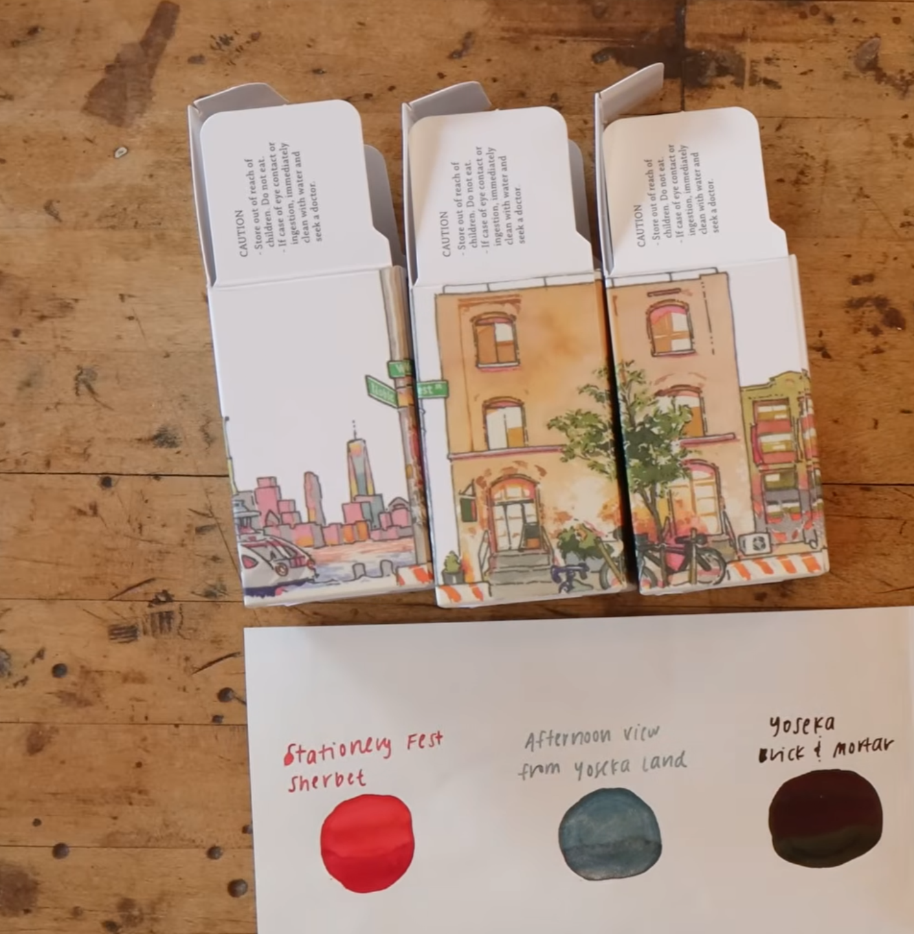
Stationery Fest exclusive ink packaging!

Painting a repeating pattern traditionally came with its own set of challenges, but I'm glad the pattern was seamless (enough). I made this right before sending the finals to Yoseka to make sure that the pattern was truly seamless.
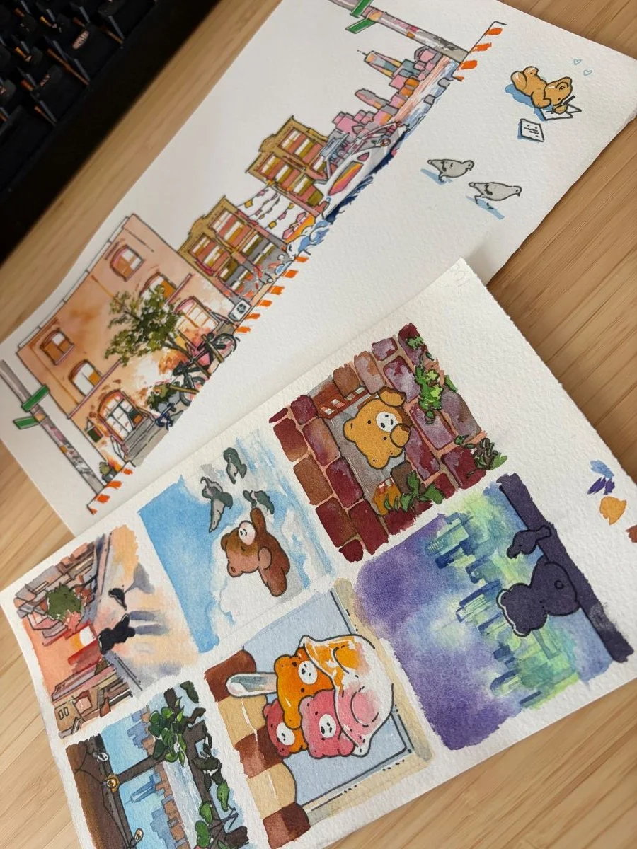
I painted the sticker labels in watercolor too, and accidentally drew them far too big for the packaging.

Yoseka Exclusive ink packaging! These sold out before I was able to get my hands on them and take pics :.)